pacman::p_load(readxl, gifski, gapminder,
plotly, gganimate, tidyverse)Hands-on Exercise 3b
Reflections
From this exercise, I learned how to create animated and interactive visualisations using gganimate and plotly in R. I learned that animations are built by stitching multiple plot frames together to show changes over time. I also practised preparing data with dplyr and tidyr before visualising it. Overall, this exercise showed me how animation can make data storytelling more engaging and useful, especially when presenting trends over time.
Introduction
This hands-on exercise focuses on creating animated and interactive data visualisations to make data stories more engaging and memorable compared to static graphics. It introduces the use of gganimate and plotly in R to build animated visuals, while also strengthening data preparation skills through tidyr for reshaping data and dplyr for processing, wrangling, and transforming datasets before visualisation.
Basic concept of animation
Animations are created by generating many individual plots and stitching them together like a flip book. Each frame uses a subset of the data, creating the illusion of movement when played in sequence.
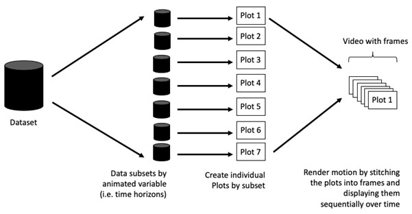
Terminology
Frame: In an animated line graph, each frame represents a different point in time or a different category. When the frame changes, the data points on the graph are updated to reflect the new data.
Animation Attributes: The animation attributes are the settings that control how the animation behaves. For example, you can specify the duration of each frame, the easing function used to transition between frames, and whether to start the animation from the current frame or from the beginning.
Food for thought:
Does it makes sense to go through the effort? If conducting an exploratory data analysis, a animated graphic may not be worth the time investment. If you are giving a presentation, a few well-placed animated graphics can help an audience connect with your topic remarkably better than static counterparts.
Getting started
Loading the R packages
plotly, R library for plotting interactive statistical graphs.
gganimate, an ggplot extension for creating animated statistical graphs.
gifski converts video frames to GIF animations using pngquant’s fancy features for efficient cross-frame palettes and temporal dithering. It produces animated GIFs that use thousands of colors per frame.
gapminder: An excerpt of the data available at Gapminder.org. We just want to use its country_colors scheme.
tidyverse, a family of modern R packages specially designed to support data science, analysis and communication task including creating static statistical graphs.
Importing the data
Data worksheet from GlobalPopulation Excel workbook will be used.
Below code chunk is to import Data worksheet from GlobalPopulation Excel workbook by using appropriate R package from tidyverse family
col <- c("Country", "Continent")
globalPop <- read_xls("data/GlobalPopulation.xls",
sheet="Data") %>%
mutate_at(col, as.factor) %>%
mutate(Year = as.integer(Year))Instead of using mutate_at(), across() can be used to derive the same outputs.
col <- c("Country", "Continent")
globalPop <- read_xls("data/GlobalPopulation.xls",
sheet="Data") %>%
mutate(across(col, as.factor)) %>%
mutate(Year = as.integer(Year))Animated data visualisation: gganimate methods
gganimate extends the grammar of graphics as implemented by ggplot2 to include the description of animation. It does this by providing a range of new grammar classes that can be added to the plot object in order to customise how it should change with time.
transition_*()defines how the data should be spread out and how it relates to itself across time.view_*()defines how the positional scales should change along the animation.shadow_*()defines how data from other points in time should be presented in the given point in time.enter_*()/exit_*()defines how new data should appear and how old data should disappear during the course of the animation.ease_aes()defines how different aesthetics should be eased during transitions.
Building static population bubble plot
Basic ggplot2 functions are used to create a static bubble plot.
ggplot(globalPop, aes(x = Old, y = Young,
size = Population,
colour = Country)) +
geom_point(alpha = 0.7,
show.legend = FALSE) +
scale_colour_manual(values = country_colors) +
scale_size(range = c(2, 12)) +
labs(title = 'Year: {frame_time}',
x = '% Aged',
y = '% Young') 
ggplot(globalPop, aes(x = Old, y = Young,
size = Population,
colour = Country)) +
geom_point(alpha = 0.7,
show.legend = FALSE) +
scale_colour_manual(values = country_colors) +
scale_size(range = c(2, 12)) +
labs(title = 'Year: {frame_time}',
x = '% Aged',
y = '% Young') 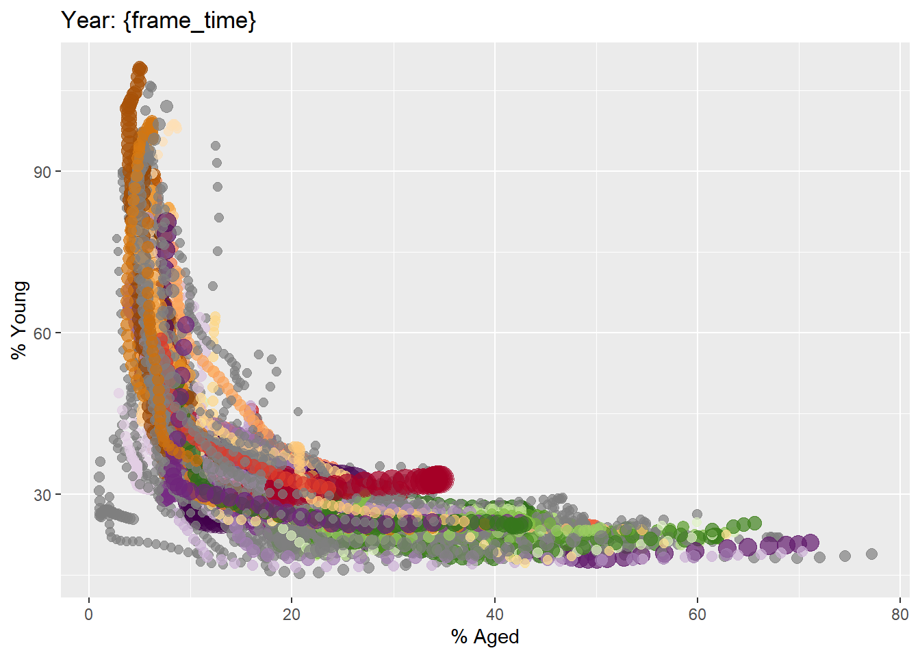
Building the animated bubble plot
ggplot(globalPop, aes(x = Old, y = Young,
size = Population,
colour = Country)) +
geom_point(alpha = 0.7,
show.legend = FALSE) +
scale_colour_manual(values = country_colors) +
scale_size(range = c(2, 12)) +
labs(title = 'Year: {frame_time}',
x = '% Aged',
y = '% Young') +
transition_time(Year) +
ease_aes('linear') 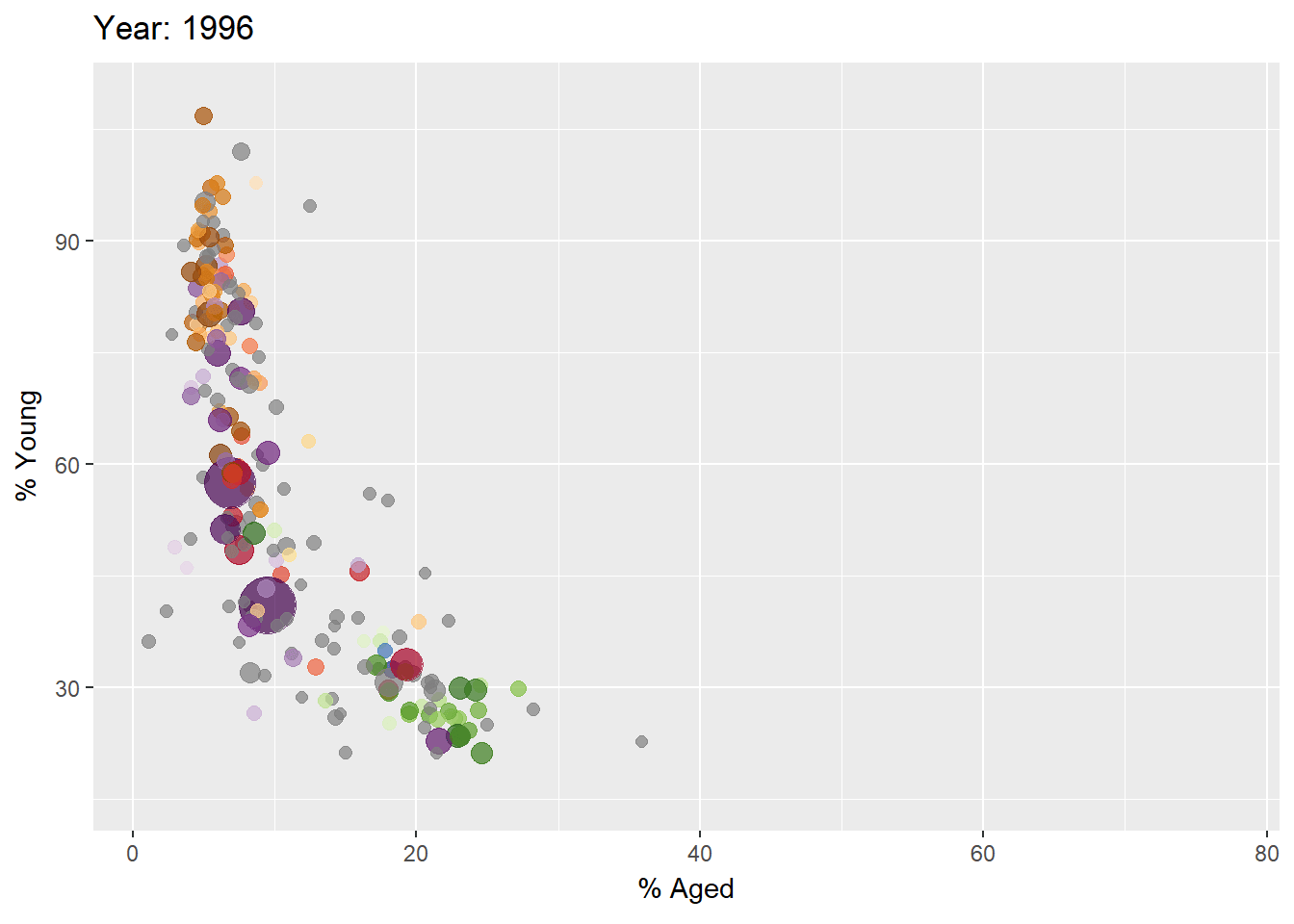
Animated Data Visualisation: plotly
In Plotly R package, both ggplotly() and plot_ly() support key frame animations through the frame argument/aesthetic. They also support an ids argument helps match same objects across frames, making animation transitions smoother and more consistent
Building animated bubble plot: ggplotly() method
gg <- ggplot(globalPop,
aes(x = Old,
y = Young,
size = Population,
colour = Country)) +
geom_point(aes(size = Population,
frame = Year),
alpha = 0.7,
show.legend = FALSE) +
scale_colour_manual(values = country_colors) +
scale_size(range = c(2, 12)) +
labs(x = '% Aged',
y = '% Young')
ggplotly(gg) The animated bubble plot above includes a play/pause button and a slider component for controlling the animation
gg <- ggplot(globalPop,
aes(x = Old,
y = Young,
size = Population,
colour = Country)) +
geom_point(aes(size = Population,
frame = Year),
alpha = 0.7,
show.legend = FALSE) +
scale_colour_manual(values = country_colors) +
scale_size(range = c(2, 12)) +
labs(x = '% Aged',
y = '% Young')
ggplotly(gg) Appropriate ggplot2 functions are used to create a static bubble plot. The output is then saved as an R object called gg. ggplotly() is then used to convert the R graphic object into an animated svg object.
Notice that although show.legend = FALSE argument was used, the legend still appears on the plot. To overcome this problem, theme(legend.position=‘none’) should be used as shown in the plot and code chunk below.
gg <- ggplot(globalPop,
aes(x = Old,
y = Young,
size = Population,
colour = Country)) +
geom_point(aes(size = Population,
frame = Year),
alpha = 0.7) +
scale_colour_manual(values = country_colors) +
scale_size(range = c(2, 12)) +
labs(x = '% Aged',
y = '% Young') +
theme(legend.position='none')
ggplotly(gg)gg <- ggplot(globalPop,
aes(x = Old,
y = Young,
size = Population,
colour = Country)) +
geom_point(aes(size = Population,
frame = Year),
alpha = 0.7) +
scale_colour_manual(values = country_colors) +
scale_size(range = c(2, 12)) +
labs(x = '% Aged',
y = '% Young') +
theme(legend.position='none')
ggplotly(gg)Building an animated bubble plot: plot_ly() method
Create an animated bubble plot by using plot_ly() method.
bp <- globalPop %>%
plot_ly(x = ~Old,
y = ~Young,
size = ~Population,
color = ~Continent,
sizes = c(2, 100),
frame = ~Year,
text = ~Country,
hoverinfo = "text",
type = 'scatter',
mode = 'markers'
) %>%
layout(showlegend = FALSE)
bpbp <- globalPop %>%
plot_ly(x = ~Old,
y = ~Young,
size = ~Population,
color = ~Continent,
sizes = c(2, 100),
frame = ~Year,
text = ~Country,
hoverinfo = "text",
type = 'scatter',
mode = 'markers'
) %>%
layout(showlegend = FALSE)
bpReference
Visit this link for a very interesting implementation of gganimate by your senior.